Overview
After an image-based player survey stalled due to content delays, I proposed and led a pivot to moderated user testing across desktop and mobile. The goal was to understand how real players navigate the Virginia Lottery website, choose games, and interpret key content like jackpots, promotions, and second chance play.
This study replaced assumption-driven decision-making with direct observation of player behavior across platforms.
Problem
The Lottery team was unable to move forward with the planned image-based survey, leaving them without current user input. As a result, they lacked clarity around how players actually navigated the site, understood game types, or evaluated promotional and reward-related content.
Implication
Moving forward without user input risked reinforcing incorrect assumptions—especially across desktop and mobile, where interaction patterns, expectations, and motivations vary significantly by age and player type. Design and content decisions made without this insight could easily miss the mark.
Users & Audience
The study focused on active Virginia Lottery players across both platforms, with intentional variation in:
Age
Gameplay frequency
Game preferences
This mix allowed us to compare how different player types approached navigation, game discovery, and decision-making on desktop versus mobile.
My Role
I led this study end to end.
That included proposing the pivot in approach, designing the test plan, recruiting participants, moderating all sessions, and synthesizing findings. I delivered the results in a slide-based report with behavioral insights, direct quotes, and usability-focused recommendations, which I presented to the full client team.
Scope & Constraints
Moderated usability testing
Desktop and mobile platforms
Qualitative behavioral analysis
No usable output from the original image-based survey
Tight timeline requiring a fast but reliable research pivot
Process (What I Did and Why)
Pivoted from survey to moderated testing
When the image-based survey stalled, I recommended moderated user testing as a faster and more reliable way to gather insight.
Why:
The team needed behavioral data, not opinions, to understand how players actually experienced the site.
Designed realistic, task-based sessions
I guided participants through realistic tasks such as finding games, evaluating jackpots, understanding promotions, and interpreting second chance and loyalty content.
Why:
These tasks reflected real player goals and revealed where expectations broke down.
Compared desktop and mobile behavior directly
Sessions were intentionally split across platforms to surface differences in navigation patterns, visibility issues, and content interpretation.
What we saw:
Mobile users relied more heavily on visual cues and placement
Desktop users explored more but still struggled with labeling clarity
Expectations around promotional carousels differed from prior assumptions
Synthesized findings into clear, actionable themes
Findings were grouped around game labeling, jackpot visibility, promotional discovery, and rewards comprehension. Each theme was backed by observed behavior and participant quotes.
Outcomes
The study directly informed design and content updates across the site.
Several recommendations were implemented, including:
Improved visibility and placement of jackpot information
Updates to content structure to reduce confusion
Adjustments to promotional presentation
One notable outcome was validating the use of a rotating promotional carousel. Despite earlier research discouraging carousels, players consistently expected and used them to discover seasonal games and drawing announcements.
What I Took Away
Watching real players beats debating assumptions every time
Platform differences matter more than teams often expect
“Best practices” need to be tested against actual user behavior
Hover State
Label is not visible on hover
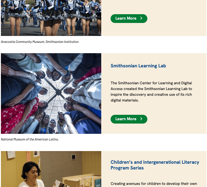
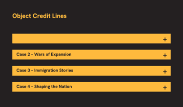
Learn More labels are
-explain-
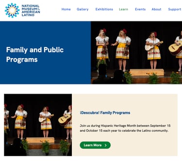
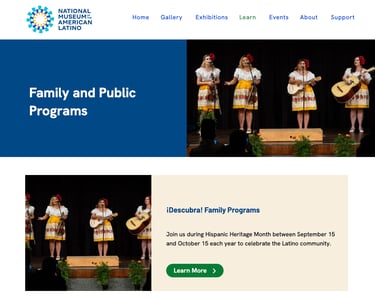
Duplicate Images
-explain-
No BCTs
-Explaiin-
Moderated Desktop & Mobile User Testing to Unblock Design Decisions
Screenshot Examples
Contact Me
Reach out anytime for a friendly chat.
Phone
brian@brianjkinsley.com
+1-734-408-1213
© 2026. All rights reserved.