
Overview
The MacArthur Foundation was exploring the addition of an interactive map to showcase awarded grants and philanthropic impact. I was brought in to develop a research-backed usability strategy to help translate leadership’s vision into a clear, intuitive, and discoverable experience for a public audience.
The project focused on how the map should be structured, labeled, and integrated with the existing grant search—so it supported understanding rather than adding complexity.
Problem
MacArthur planned to introduce an interactive grant map alongside its existing grant search but lacked guidance on how the map should be presented, explained, and differentiated for users.
Key questions were unresolved:
Where should users encounter the map?
What data should it show?
How should filters, pins, and controls behave?
How could the map complement—not duplicate—the existing search experience?
Implication
Without clear structure, the map risked becoming:
Redundant with search
Difficult to find
Confusing to interpret
Overloaded with unexplained controls or visuals
Any of these would undermine the Foundation’s goals around transparency, storytelling, and public engagement.
Users & Audience
This work focused on a broad public audience, including:
General visitors exploring MacArthur’s funding reach
Information seekers looking for geographic or topical patterns
Stakeholders interested in understanding impact at a glance
User needs were evaluated through usability principles, peer patterns, and expectation-setting rather than direct testing.
My Role
I served as the lead usability analyst and owned the work end to end.
I defined the research focus, analyzed peer implementations, reviewed usability standards for interactive data and maps, and translated findings into a client-ready report. I also adapted the work mid-project when scope shifted to clarify how the map should integrate with the existing grant search.
Scope & Constraints
Exploratory usability research and strategy
Desktop-focused review
No prototype or live map available
Map intended to supplement, not replace, the grant search
Emphasis on long-term scalability and clarity
Process (What I Did and Why)
Analyzed peer map implementations
I reviewed interactive grant maps and data visualizations across philanthropy and adjacent industries to identify patterns that supported clarity, discoverability, and comprehension.
Why:
Without a live product, peer analysis was the most effective way to surface proven interaction patterns and avoid common pitfalls.
Evaluated map discoverability and placement
I examined whether maps were embedded or linked, how users encountered them, and how placement affected engagement and understanding.
Key focus:
Ensuring the map would be visible and approachable without competing with existing navigation.
Assessed interaction and data presentation patterns
I reviewed how peer maps handled:
Pin scaling and visual logic
Toggling between current and historical data
Zoom behavior and geographic context
Why:
Unclear visual logic is one of the fastest ways to lose user trust in data-heavy interfaces.
Reviewed filter visibility and labeling
I evaluated how filters such as location, year, program, and funding type were presented, labeled, and explained.
Goal:
Filters needed to feel intuitive and self-explanatory without requiring instructions.
Adjusted strategy when scope shifted
Mid-project, it became clear that the map should support the existing grant search—not replace it. I reframed recommendations to emphasize integration, showing how the two experiences could work together without redundancy.
Outcomes
I delivered a structured research report and slide deck outlining best practices and usability guidelines for implementing the interactive map.
Deliverables followed a consistent format:
One insight per slide
Clear usability rationale
Visual references
Focused, actionable recommendations
The report was designed for independent review, allowing stakeholders to evaluate and apply recommendations as the map moved toward design and development.
What I Took Away
Interactive maps succeed or fail based on explanation and context, not visuals
Discoverability matters as much as functionality
Usability strategy is often about helping teams avoid building the wrong thing
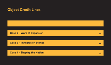
Hover State
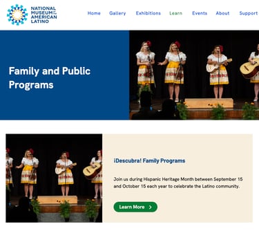
Label is not visible on hover
Learn More labels are
-explain-
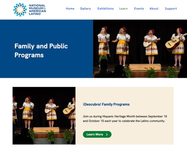
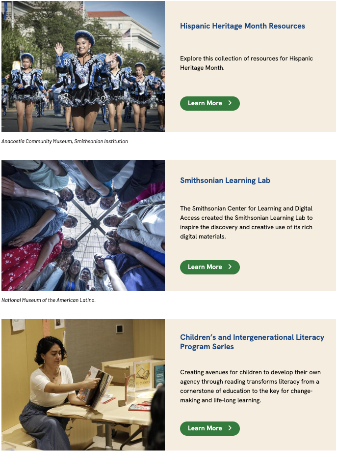
Duplicate Images
-explain-
No BCTs
-Explaiin-
Usability Strategy for Interactive Grant Map Implementation
Screenshot Examples
Contact Me
Reach out anytime for a friendly chat.
Phone
brian@brianjkinsley.com
+1-734-408-1213
© 2026. All rights reserved.